nr2207
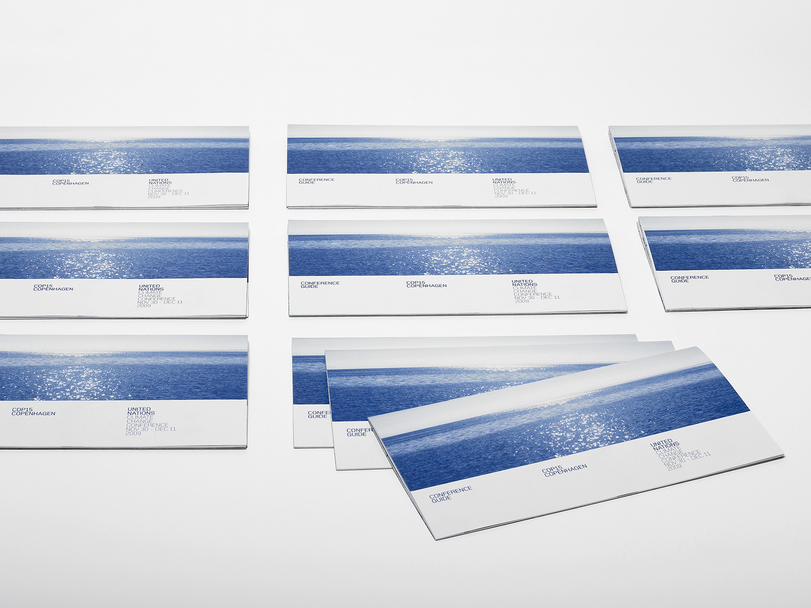
COP15
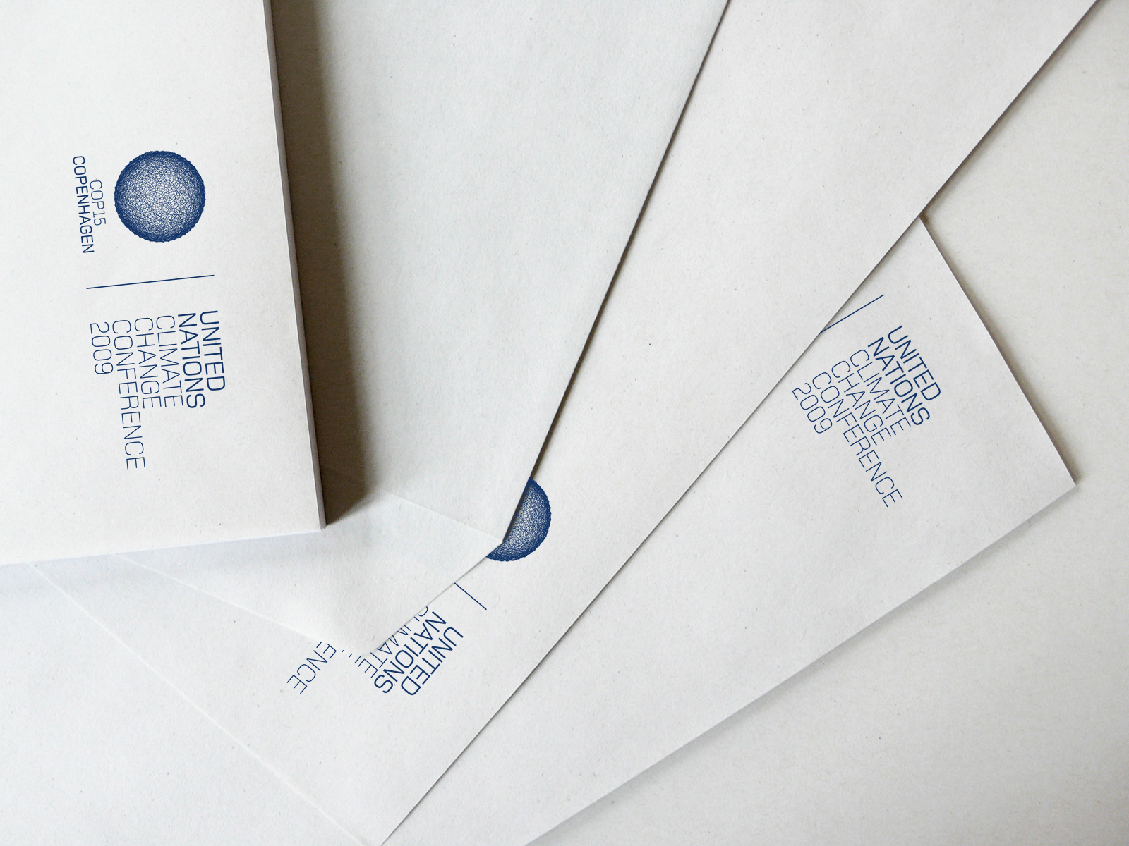
The logo for the United Nations Climate Change Conference in Copenhagen was chosen in an open competition. The logo was a blue planet made up of a complex network of strings – both resilient and fragile.
LOGO AND VISUAL IDENTITY

192 lines – one for each member state of the United Nations – are distorted to display a globe going from balance to unrest and hopefully back to balance.
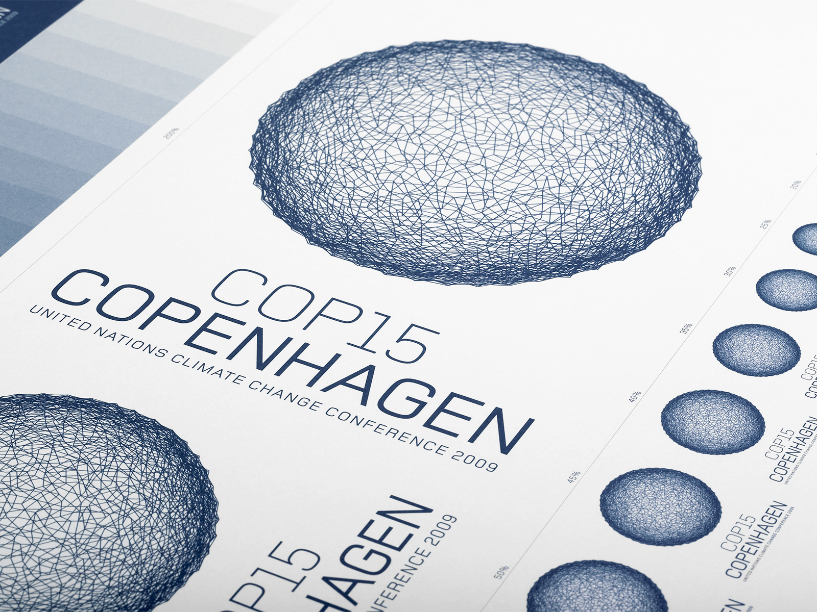


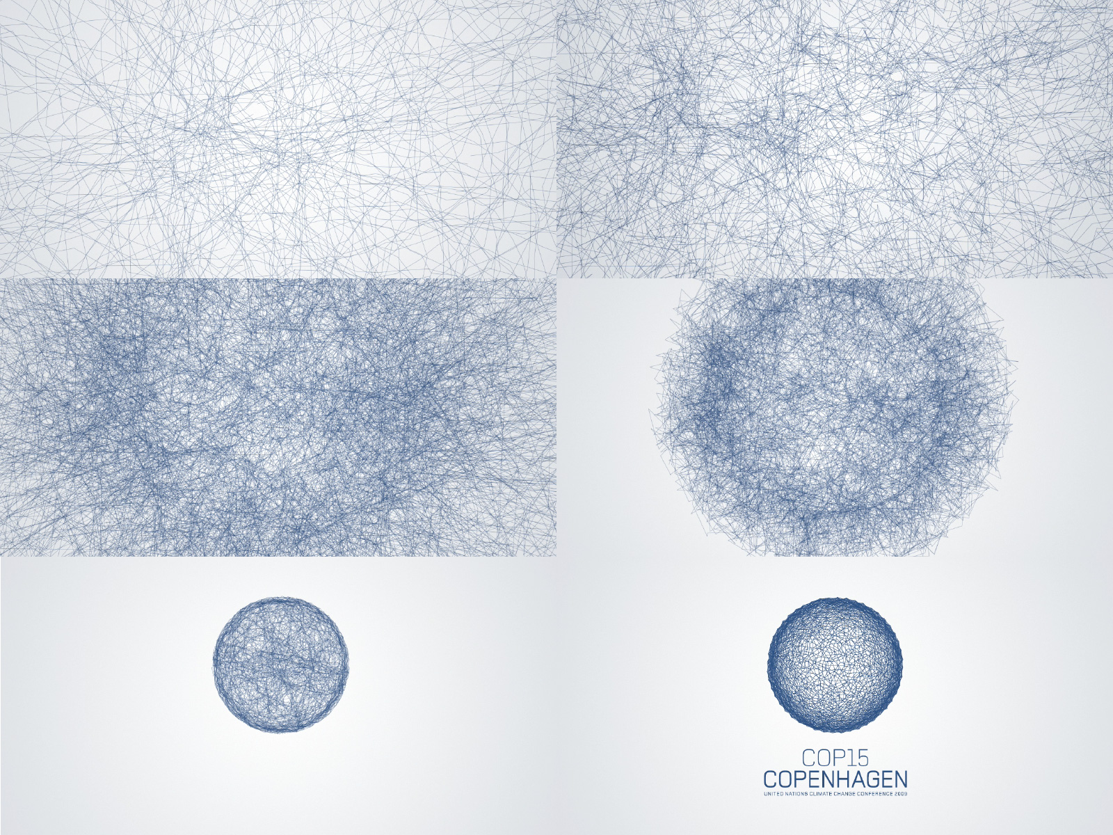
The initial inspiration came from a graph showing the earth's temperature vs. the amount of CO2 in the atmosphere.


A series of stamps with illustrations of environmental solutions.
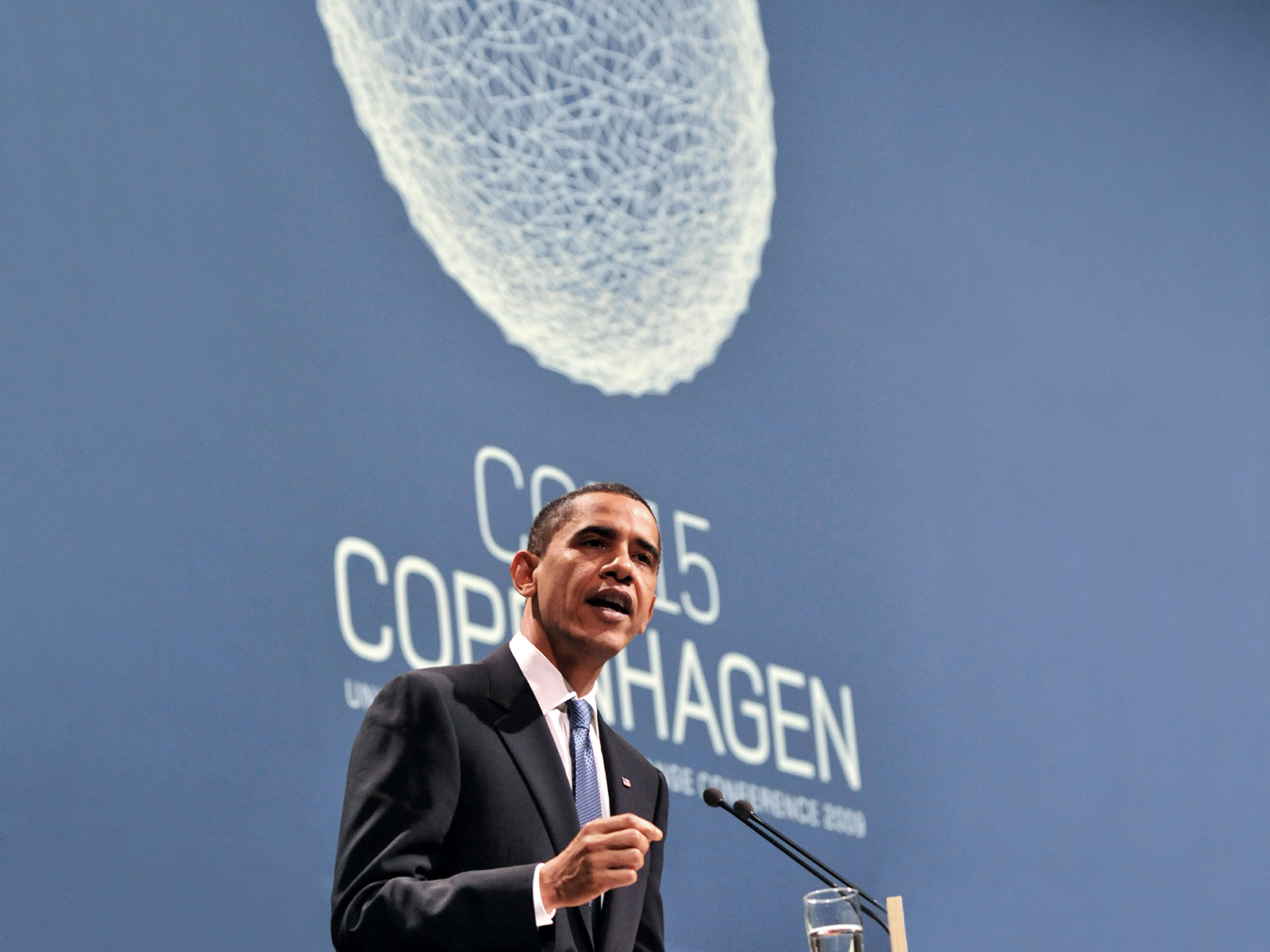
Photo: Attila Kisbenedek/AFP/Ritzau Scanpix
"So the question before us is no longer the nature of the challenge – the question is our capacity to meet it. For while the reality of climate change is not in doubt, our ability to take collective action hangs in the balance."
U.S. President Barack Obama speaking at the conference
"…I have not seen such a good logo for a long time. Clearly, it is a globe which looks fragile. The fragile look reflects the difficult balancing act in climate policies and the risk that a good many things may go wrong."
graphic designer Erik Spiekermann
"The aesthetic expression is excellent. I really like the way the logo seems to be drawn in pencil, because it sends out a multiplicity of meanings. It may be interpreted as if this is your own personal globe which is available to us all because we can all draw it."
graphic designer Peter Saville